Redesigning a $4.4 billion aviation education industry
Project Overview
Designing a solution to the 90% Drop Out Rate
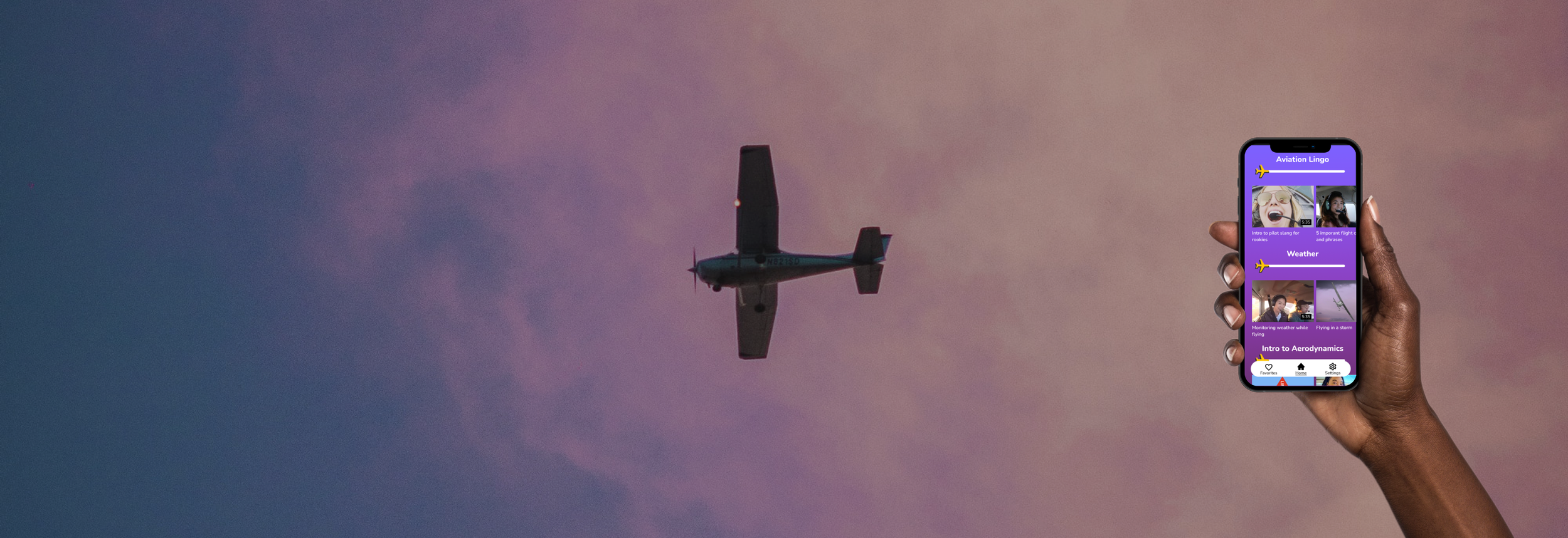
Female student pilots have a 90% dropout rate. I interviewed 15 stakeholders to learn more about the user journey of this group and the pain points they face. Additionally, students who do not have any prior exposure to aviation are learning what they describe as a “new language” as they are learning new aviation terms at the same time as they are trying to consume new, complex aviation concepts. None of the competitors I looked into try to address this problem. You can read about the UX design process below. Or view prototype.
Roles: UX Researcher, UX/UI Designer | Duration: 12 weeks | Digital Tools: Figma, Miro, Illustrator
Expertise: User Interviews | Personas | Affinity Clustering | Wireframes | Prototypes | Usability Testing | UX/UI | Branding | User Testing
Design Criteria: Converging on an MVP
-
🐥 Beginner-Friendly
Approachable to people with no aviation knowledge.
New students currently have a limited amount of approachable material readily available. Many competitors include advanced aviation jargon in their apps, which turns new students away.
-
🍎 Bite-sized
Education material must be easily digestible.
Students are overwhelmed by massive amounts of complex information and currently follow a manual process to try to break down large blocks of complex information into bite-sized chunks
-
📱 Less to carry
Portable, easy to carry tool;
Students currently rely on heavy text books and desire portable learning tools. The digital solution should be a mobile app or mobile-first desktop application
-
⛰️ Goal-oriented
Progress can be tracked.
Stakeholders talked about the difficulty and importance of keeping their end goal in mind so that when things are challenging, they remember what they’re working towards
Finding a solution: Coming up with multiple concepts during an ideation phase
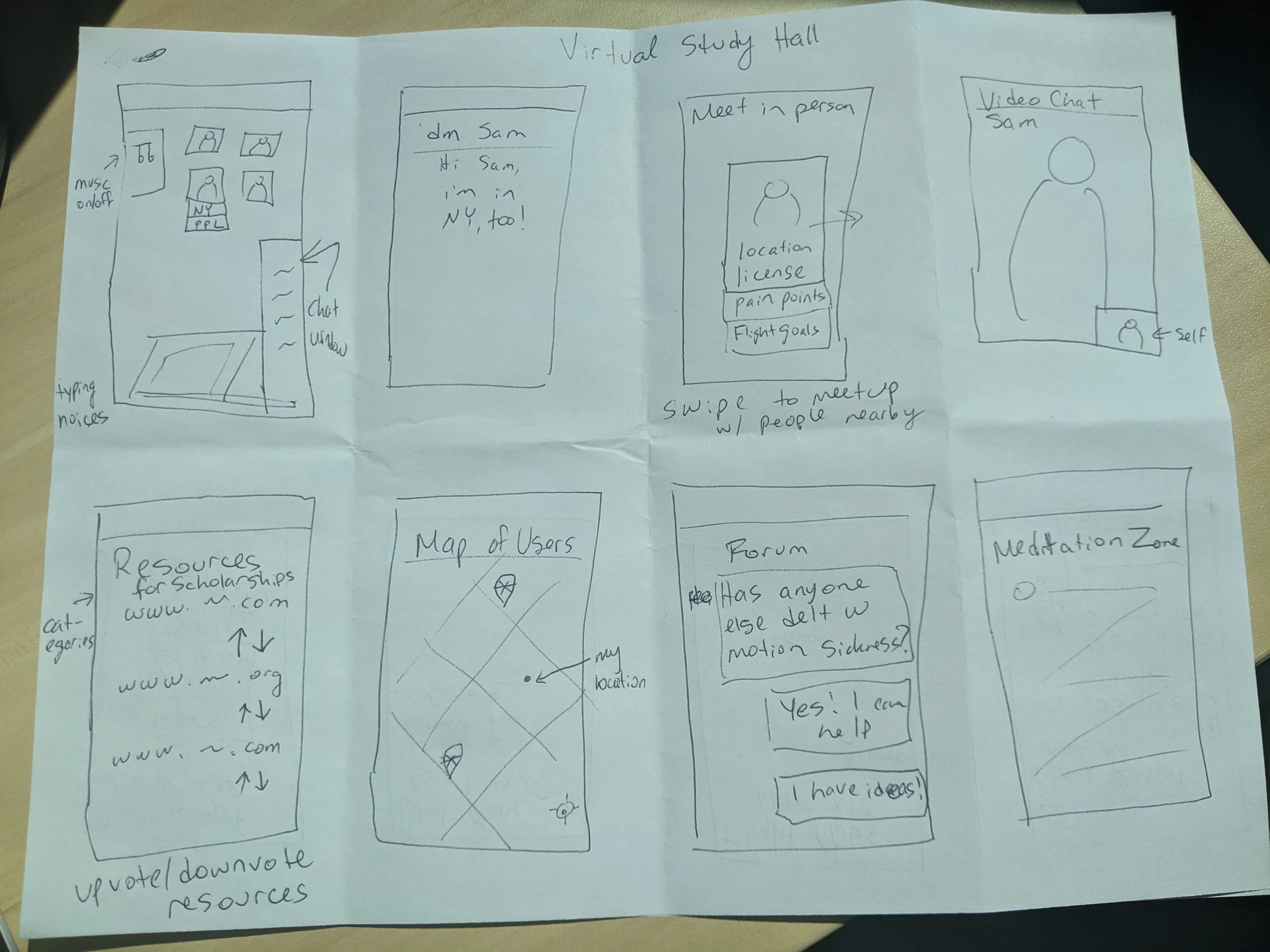
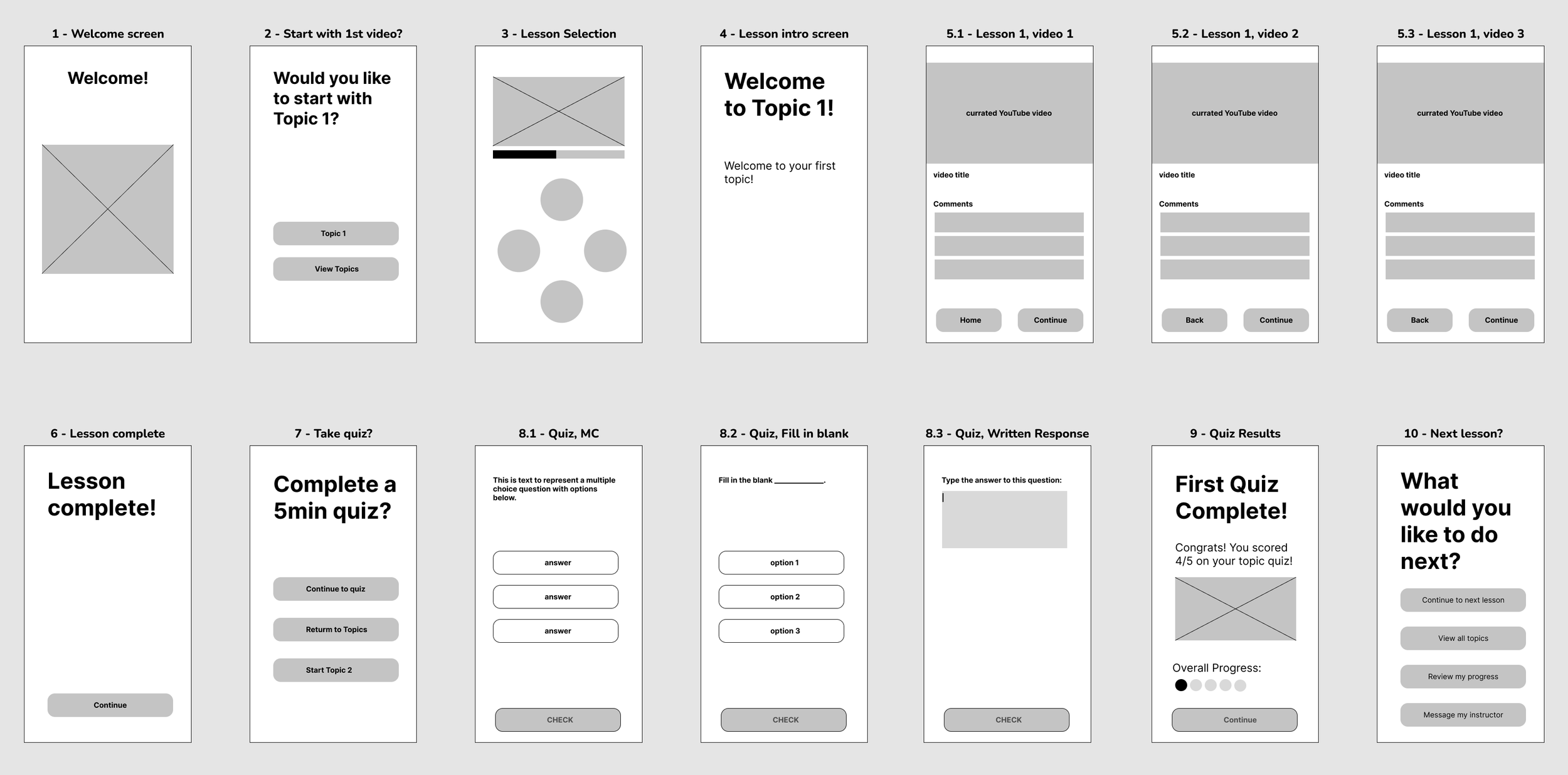
Navigation and flow: The key path scenario for this app is completing a single lesson and taking a related quiz
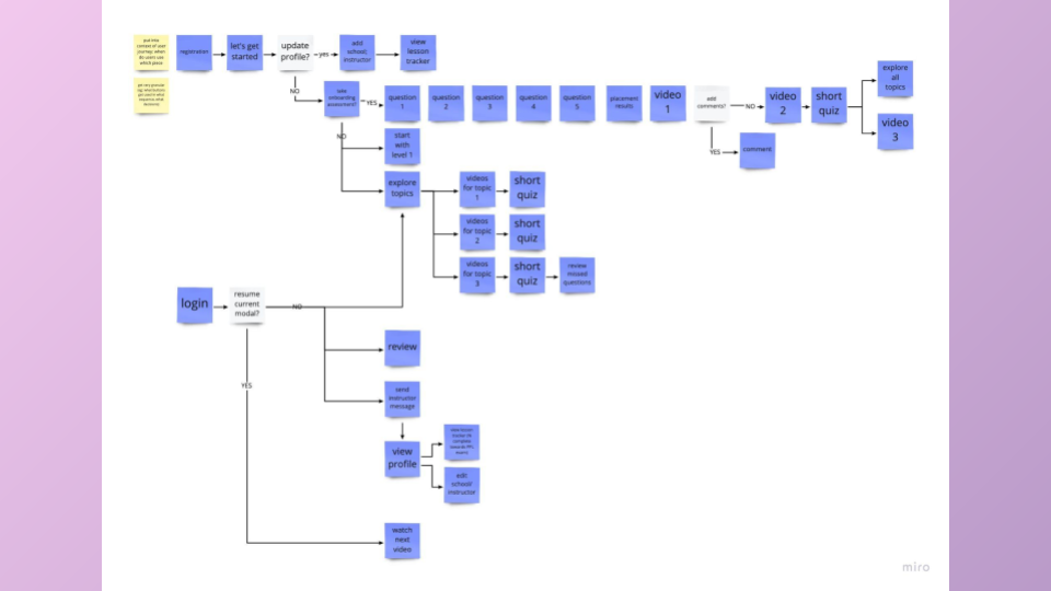
Wireframing: The key calls to action are launching the first lesson and completing a quiz on the lesson content.
Design Iteration
-
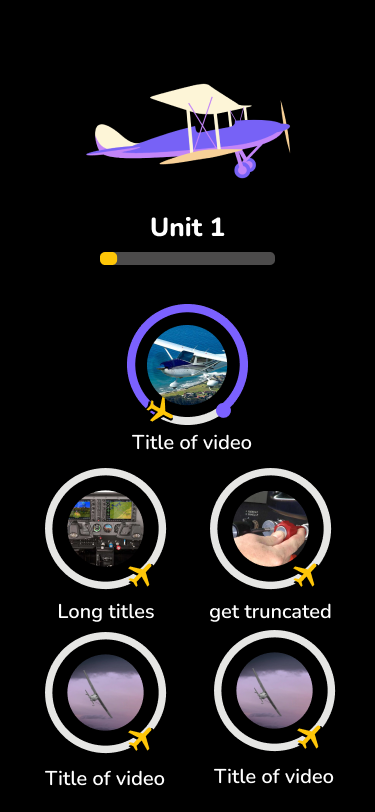
v1
Early iteration of lesson selection screen for Private Pocket Pilot
-
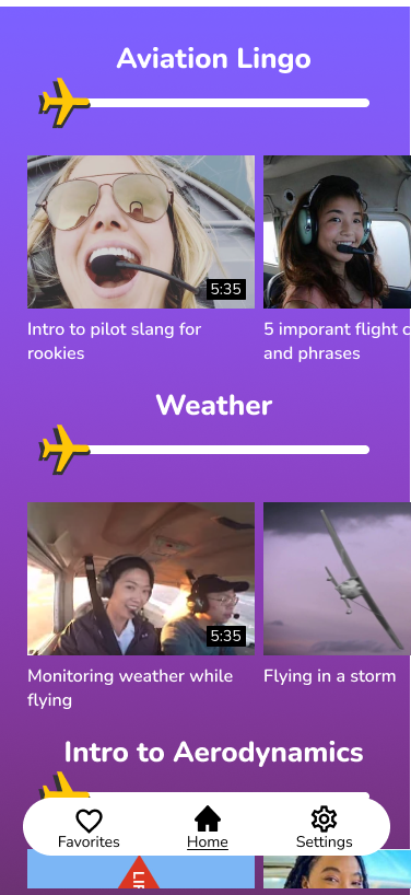
v2
2nd iteration of lesson selection screen for Private Pocket Pilot
-
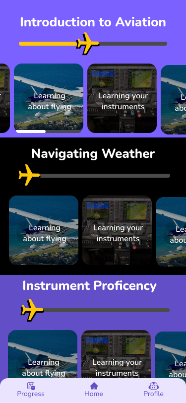
v3
3rd iteration of lesson selection screen for Private Pocket Pilot
-
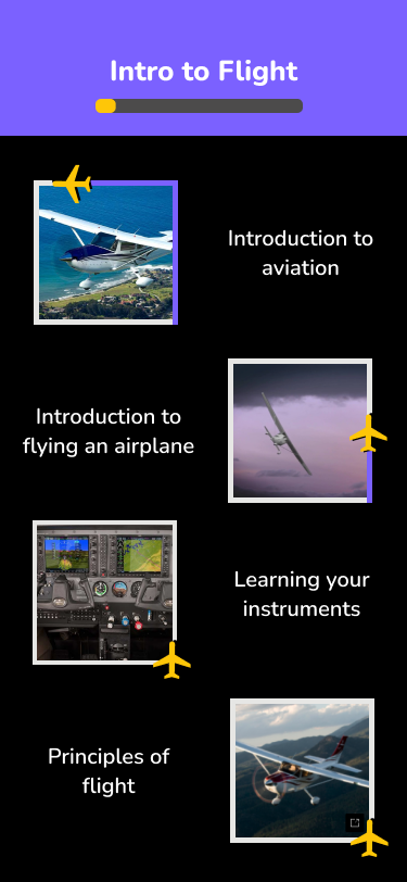
v4
Final iteration of lesson selection screen for Private Pocket Pilot
View Prototype
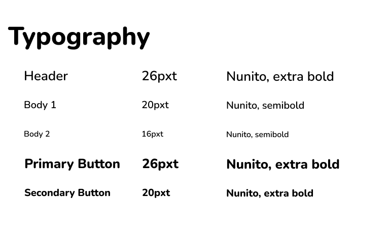
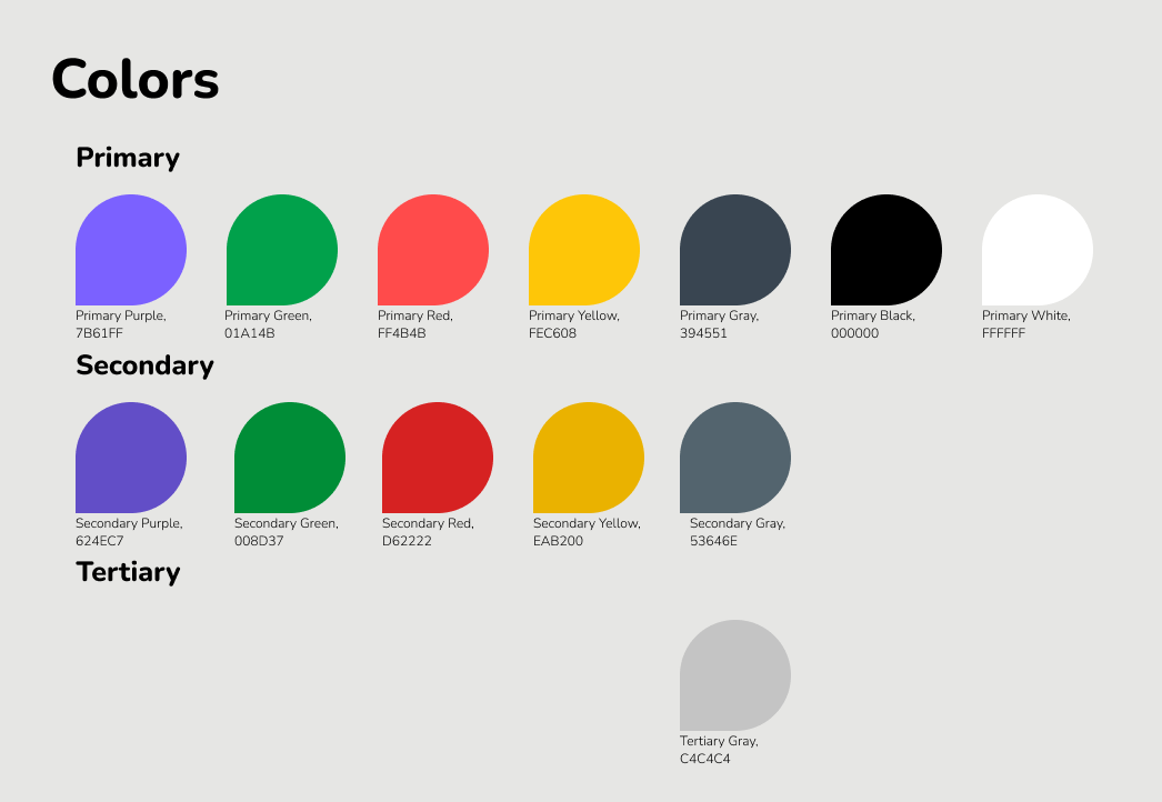
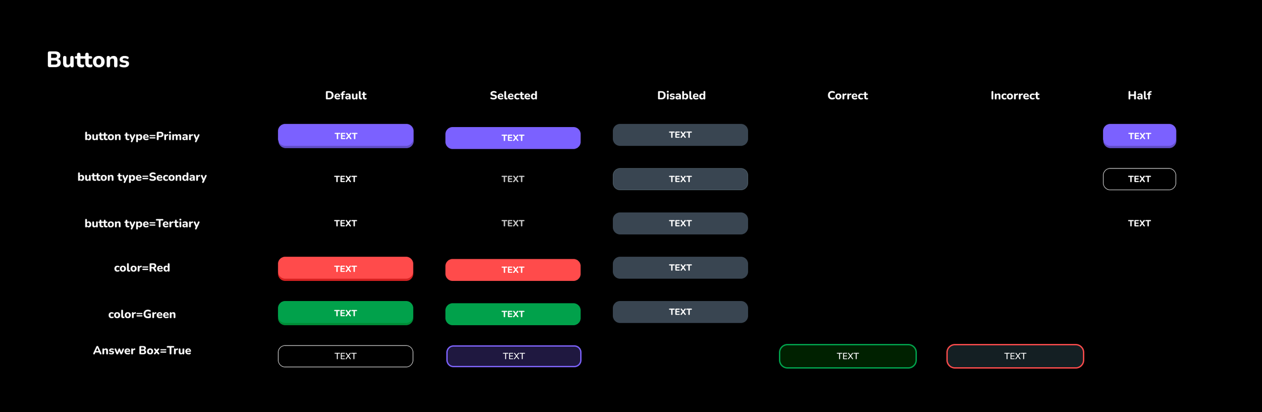
Design System

Usability Testing
During moderated user testing, I asked participants to complete the following tasks:
Identify the purpose of the lesson selection screen and the available actions
Find a lesson about aviation lingo
Identify available action on the video page
Find a 3min video to watch
Save this video for later, and locate the saved video.
Roadmap:
-
💬 Phase 2: Enhanced social components
Comment on videos
Compare progress to peers
Interstitial screens letting you know how many users are study the same section as you
Peer to peer chatting
-
🛤️ Phase 3: Increased Progress Tracking
Highlight progress towards multiple career paths for a pilot
Provides average time and cost estimates
Averages can be swapped out for custom values
-
👩🏫 Phase 4: More Connection to Instructor
Video call with instructors
Live chat during “office hours”
Custom content uploaded by instructors
-
▷ Phase 5: Mixed Media Experience
Additional resources, such as pdfs relating to videos
Short TikTok-length videos
Interactive, in-video quizzes with gamified rewards